Previous articles:
- Intro: A few words about the event itself
- Part 1: How we worked at the organisation
- Part 2: Experiencing autonomy, mastery, and purpose as attendees
A look at some of the tools that contributed the most to engagement
So far I talked about how putting people at the centre has been the key to the success of this event.
I want to close by spending a few words also about the tools (digital and analog) that contributed more than others to provide a good experience for the attendees.
Sli.do
While it is true that tools are just tools and what really matters is how you use them, a good tool makes it easier to provide a great experience, and Sli.do is definitely a good tool.
We used it to engage with the attendees, both in person and remote, throughout the entire event.
We collected questions, ran polls and quizzes, and asked for feedback.
It was fun, incredibly easy to use, and enabled us to embed in the event any input from the audience, in real time.
The best feedback I received was from a remote attendee, who told me “Thank you for Sli.do, I am feeling as part of the action as if I was there with you”.
Workplace + Website
Workplace by Meta is the tool we use for internal communications in the Company. We created a dedicated group for the Camp, having only the attendees as members, and we used it to live-stream the plenary meetings (kickoff, session on strategy and vision, wrap-up), as well as for any announcement.
I also created an ’event’ in the group for every breakout sessions of the Open Space. People automatically received a calendar invitation for every session in which they expressed interest or intention to participate, and in this way they created a personalised version of the agenda for the Thursday in their own calendar.
Information was persisted in a dedicated website made with Google Sites, which was a convenient choice because we could seamlessly embed maps, slide decks, spreadsheets, and other materials hosted in Google Drive.
Content management is where I started my career, and I still love it! Federica and I made sure that contents were relevant for the audience at any moment of their journey: as invitees, before the event took place, as attendees, during the event, and as a group of people with shared memories, once the event was over.
The combination of the two tools did a great job at keeping people on the same page.
Badge
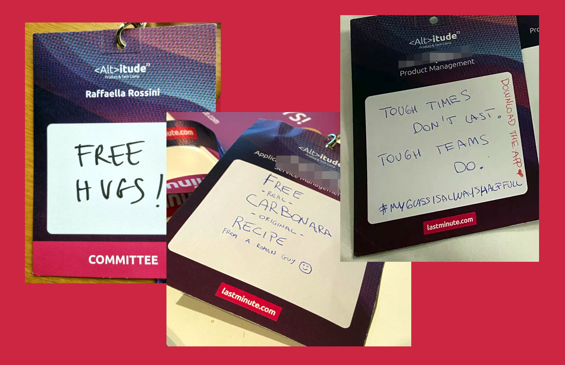
The badge as a tool? Yes, of course! We used it as a networking tool, and also as a map to help people navigate the event:
- On the front we printed some key info about the person wearing it, and we left a blank space where people could draw or write something about themselves, something that could be used as a conversation starter, to bring people closer. The badge in the picture is mine, and as a result I hugged a lot of people, and laughed with them!
The best feedback I got about the badge was from a developer who told me “I wrote DDD, yesterday I had a great chat with a colleague I never met before about it, and today we had lunch together”. Mission accomplished! - On the back we printed a QR code with the link to the detailed schedule of the event on the Website, so that people could have at their fingertips the overview of what was supposed to happen and where.
Branding
I am a big fan of simplicity and I prefer calling things with their names (I mean, the name I gave to the Handbook of the Company is…drum roll…‘The Handbook’), but in this case creating a name for the event which summarised some important messages in a single word, and defining a visual identity that was then consistently applied in all touchpoints (slide decks, Workplace Group, Website, video walls on the premises, t-shirts, badges, swag…even Instagram stickers and wallpapers for laptop and mobiles) played a pivotal role in providing an engaging and immersive experience.
